
20th century nostalgia isn’t going anywhere, and plenty of brands are cashing in on the desire for more old-fashioned graphics.

Portuguese lettering artist and type designer Rafael Serra has clearly taken note, and recently presented his own endearing, ’80s-inspired logo redesigns.
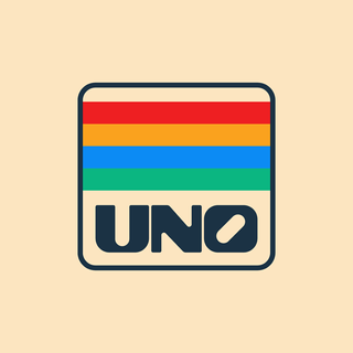
While most of the brands he chose already retain a strong ’80s association, like Vans or Uno, he doesn’t shy away from modern tech, like Spotify and Playstation. The designs feature a light spot-the-reference feel that ’80s kids are sure to love. Serra’s reimagined Spotify logo recalls a glitchy landscape from Tron, while Microsoft and Playstation’s color-blocked squares evoke the classic look of handheld memory game Simon. Clean lines and poppy, streamlined colors ground his designs in the here and now.


Source: printmag
Comments